Olympiad Sports Complex
BRANDING • PRINT • DIRECT MAIL • CONTENT STRATEGY
Project
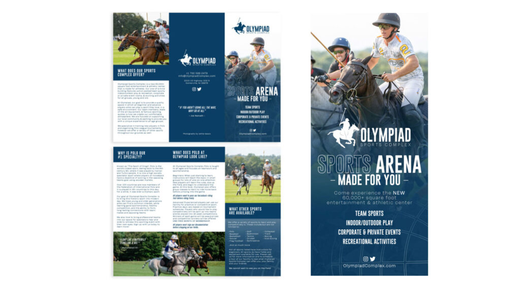
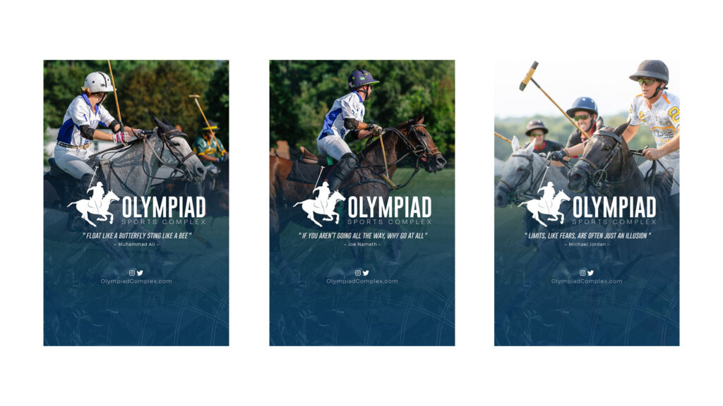
Introducing a traditional and elite sport like polo to a modern audience is challenging, but by leveraging Jamie Issacs’ evocative imagery and carefully selected textures and colors, we crafted a contemporary brand personality that resonates today. Our goal was to honor polo’s rich history while appealing to the sensibilities of a present-day crowd.
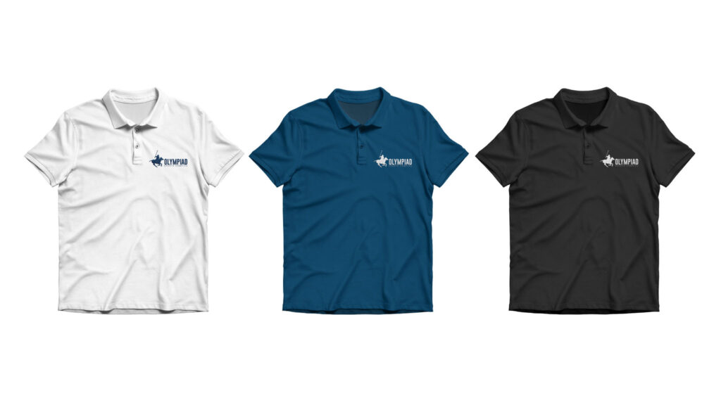
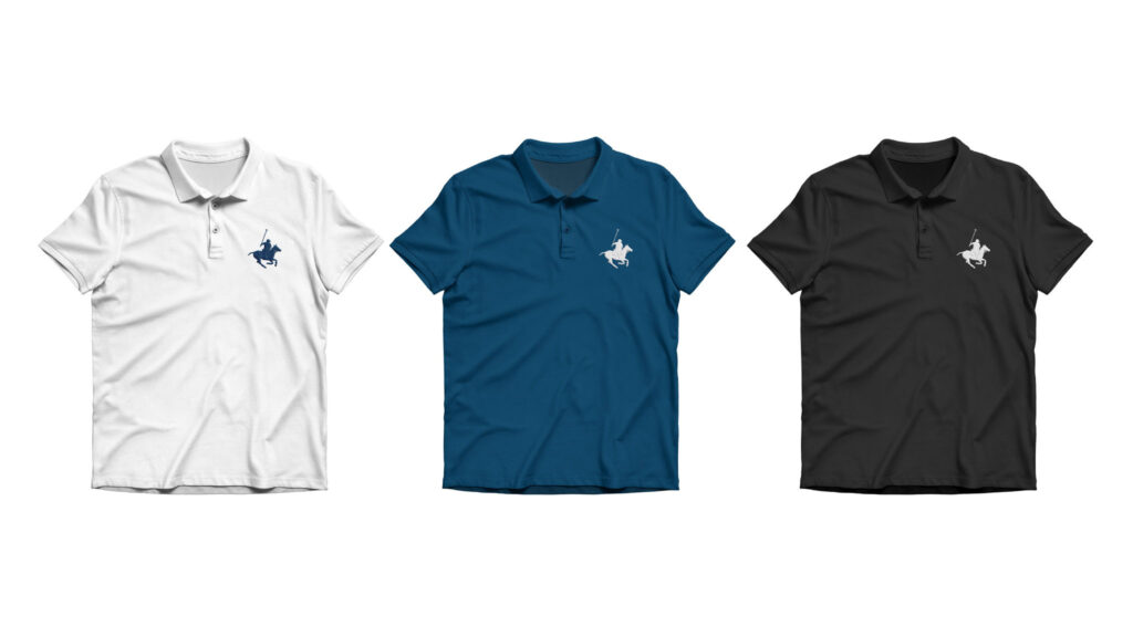
A crumpled plastic overlay was used across collateral to symbolize the sport’s deep-rooted heritage, adding authenticity and evoking timelessness while fitting seamlessly into modern design. To bridge tradition and modernity, we introduced a minimalist globe icon, representing polo’s global relevance, and used a bold, modern blue to signal a fresh take on the sport. This blend of historical reverence and contemporary design effectively positions polo as both prestigious and accessible, ensuring it resonates with new audiences while respecting its legacy.
Objective
The goal was to develop a brand and collateral material to expand the Olympiad name across diverse demographics, with a focus on promoting polo and exciting new audiences to engage with the sport. Targeting athletes of all ages, but with a primary emphasis on polo enthusiasts, we crafted a dynamic brand identity that honors polo’s tradition while making it relevant for modern players.
The branding combines the elegance of polo with contemporary design, using bold visuals and energetic messaging to capture the thrill of the game. We addressed the challenge of modernizing polo by integrating interactive digital content and engaging promotional materials that appeal to both seasoned players and newcomers. This approach positions Olympiad as a leading force in polo, driving its growth and attracting a broader audience to the sport.
Execution
Drawing from Jamie Issacs’ impactful imagery, we crafted a visual grid to guide the viewer’s eye smoothly from the upper left to the lower right, leading to a carefully designed vector icon and a cohesive typographic lockup. The brand’s look and feel were heavily influenced by the color, lighting, and composition in Issacs’ photos, with each element thoughtfully integrated to reflect the mood and essence captured in the imagery.
This design approach ensured that the brand identity was not only visually compelling but also deeply connected to the aesthetic qualities of the photography, creating a harmonious and intentional visual experience.