Argon Production Co
BRANDING • PRINT • WEB DESIGN • CONTENT STRATEGY

Project
M. Scott Media was tasked with creating a unique brand personality for Argon Production Co., with a focus on incorporating an interactive element into their sound production services. The goal was to elevate their print and digital marketing efforts by integrating engaging and interactive features that highlight the vibrant and dynamic nature of their work. This involved developing interactive web content and designing immersive print materials, all aimed at inviting potential clients to explore and connect with the brand in innovative ways. By blending these elements, we sought to enhance Argon Production Co.’s brand presence and foster a deeper engagement with their audience.

Objective
Develop a comprehensive brand identity and messaging strategy for Argon Production Co. that will not only launch the company effectively but also support its growth in a competitive market. The objective is to craft a distinctive brand presence that sets Argon Production Co. apart from its competitors. This includes designing a unique visual identity and voice that reflect the company’s innovative approach to sound production.
In addition to establishing a strong brand foundation, integrate interactive elements into both digital and print platforms to enhance audience engagement. These interactive features could include dynamic website components, interactive social media content, and engaging print materials that invite users to actively experience the brand. By incorporating these elements, we aim to create a memorable and immersive brand experience that highlights Argon Production Co.’s distinctive qualities, fosters deeper connections with potential clients, and positions the company as a forward-thinking leader in the sound production industry.

Execution
Argon, being a colorless and odorless gas, served as an inspiration for the design of the logo. The logo was deliberately crafted in a monochromatic scheme to reflect the gas’s invisible nature. A subtle nod to a “Do Not Enter” sign was incorporated into the design of the “O” to symbolize restriction and precision in the sound production field.
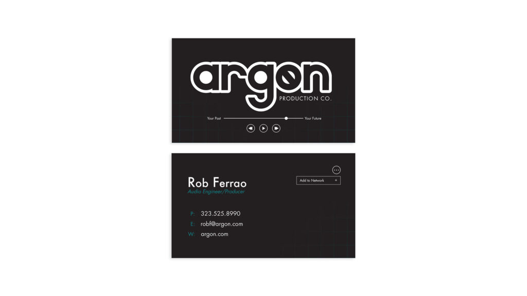
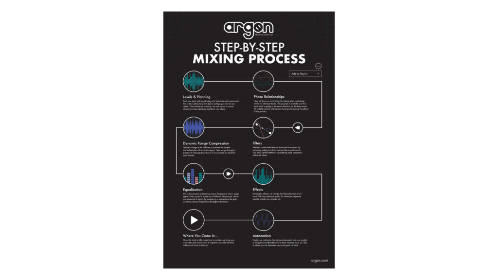
To further emphasize the brand’s scientific and technical roots, a periodic table grid was introduced as a background element across all collateral materials. This grid not only reinforces the brand’s connection to the scientific aspect of sound production but also provides a consistent visual theme. Additionally, a faded color scheme was used throughout the branding to evoke the idea of the gas’s transparency and subtle presence.
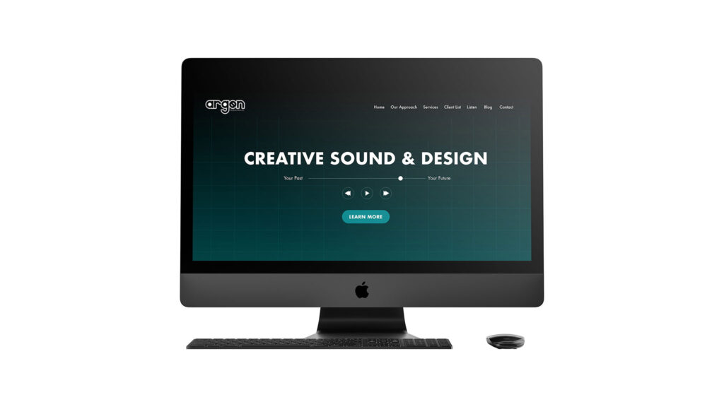
For the interactive components, various graphics resembling a phone’s music player were integrated into the collateral materials. These elements are designed to engage users by mimicking familiar digital interfaces, creating an interactive and immersive experience that aligns with the brand’s innovative approach. This blend of visual and interactive design elements helps to distinguish Argon Production Co. from its competitors, positioning it as a modern and technologically savvy player in the industry.

