The Mad Hatter Blog & Editorial
BRANDING • PRINT • WEB • CONTENT STRATEGY
Project
M. Scott Media was tasked with creating the brand personality for The Mad Hatter Blog & Editorial, a new media organization focused on art, music, life, and culture with a rebellious twist. The goal was to craft an identity that clearly communicates their edgy, nonconformist approach to content and perspective.
We developed a brand personality that embodies The Mad Hatter’s bold and irreverent spirit, making it instantly relatable to readers who crave creativity and fresh, unfiltered takes on contemporary issues. By infusing this rebellious culture into every aspect of the brand, we ensured The Mad Hatter stands out in a crowded media landscape, attracting an audience that values its daring perspective.
Objective
Develop a bold, rebellious brand and personality that seamlessly spans both print and digital platforms, effectively delivering editorial content to a wide audience. The brand should challenge norms with striking visuals, edgy typography, and provocative messaging that resonate with those who appreciate a daring approach to media.
The design will feature gritty textures, bold contrasts, and dynamic layouts, creating a strong, consistent identity across all mediums. Digital materials will engage audiences with interactive elements and innovative content delivery, ensuring the brand stands out and attracts a loyal following that values its unique voice and perspective.
Execution
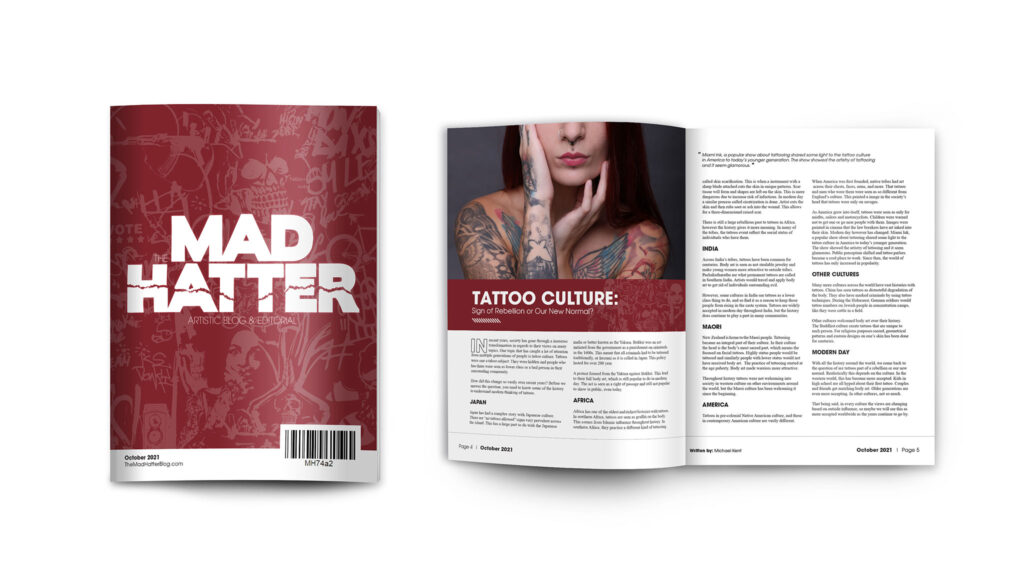
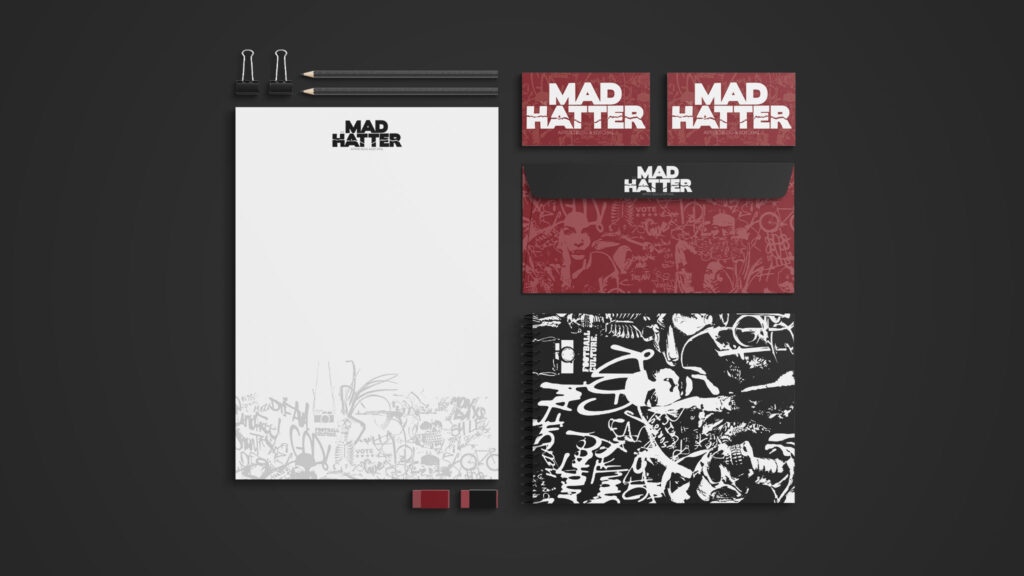
To design The Mad Hatter’s logo, we adopted an unconventional approach. We began by creating a typographic lockup using modern sans-serif fonts. This lockup was then printed and physically torn across the word “Hatter,” adding a rebellious edge to the design. The torn piece was scanned and vectorized, resulting in a logo where the jagged tear in the blocky letters immediately conveys a sense of defiance.
For the magazine, we developed a pattern of illustrations featuring skeletons, tattoos, graffiti, and cameras, reflecting the rebellious spirit and thematic diversity of the editorial content. This design element emphasizes the bold, unconventional nature of the magazine’s topics.
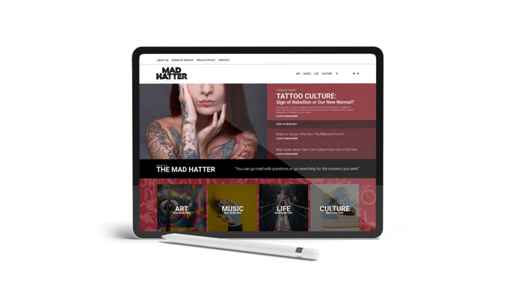
Inside the magazine, each article is neatly laid out to ensure readability and focus on the content. The blog mirrors this design aesthetic, using attention-grabbing patterns for calls-to-action while maintaining a clean and simple layout for easy reading. This cohesive design approach enhances the overall rebellious brand personality while ensuring clarity and engagement for the audience.